DataCamp boasts to be “the easiest way to learn Data Science Online” and has courses of different levels taught using R or python. I wanted to see how popular some of the courses were and which technology they used, so a quick use of rvest was required. Rvest is a package developed by Hadley Wickham that allows one to easily scrape web pages. Below is the function used to get the relative links for each course based on the technology used.
get_course_links <- function(technology){
  url <- paste('https://www.datacamp.com/courses/tech:', technology, sep='')
  html <- read_html(url)
  courses_title <- html_nodes(html, css='.course-block__link') %>%
    html_attr('href')
  return(courses_title)
}
I essentially go to the page, find which parts of the page correspond to the specified css paths, then which parts have the specified ‘href’ attribute i.e. which are links.
I then wrote another function get_course_data, that uses rvest, dplyr, some stringr with regex, etc. to get information for each course such as the number of participants, title of course, number of pre-requisites, so on and so forth. Below are the five courses using R or Python with the most number of participants. As you can see, there are only two courses under ‘SQL’, as other database courses seem to focus on dplyr (R) or pysqlite (python) and are thus under those categories.
courses_all <- read.csv("dat/all_courses_scrape_df.csv")
arranged_courses <- courses_all %>% group_by(tech) %>%
  select(title, num_participants, num_prereqs, tech) %>%
  arrange(desc(num_participants)) %>% split(., .$tech, drop=T)

arranged_courses$python %>% top_n(5, num_participants)
## # A tibble: 5 x 4
## # Groups:   tech [1]
##                                  title num_participants num_prereqs   tech
##                                 <fctr>            <int>       <int> <fctr>
## 1     Intro to Python for Data Science           452593           0 python
## 2 Intermediate Python for Data Science           127312           1 python
## 3              Deep Learning in Python            31527           3 python
## 4 Python Data Science Toolbox (Part 1)            29021           2 python
## 5    Importing Data in Python (Part 1)            26001           2 python
arranged_courses$R %>% top_n(5, num_participants)
## # A tibble: 5 x 4
## # Groups:   tech [1]
##                                      title num_participants num_prereqs
##                                     <fctr>            <int>       <int>
## 1                        Introduction to R           558270           0
## 2                           Intermediate R           160942           1
## 3        Data Manipulation in R with dplyr            55803           2
## 4         Introduction to Machine Learning            53502           3
## 5 Data Visualization with ggplot2 (Part 1)            51080           2
## # ... with 1 more variables: tech <fctr>
arranged_courses$sql
## # A tibble: 2 x 4
## # Groups:   tech [1]
##                           title num_participants num_prereqs   tech
##                          <fctr>            <int>       <int> <fctr>
## 1 Intro to SQL for Data Science            54973           0    sql
## 2    Joining Data in PostgreSQL             6413           0    sql
Below are the number of courses w/ prerequisites as well as the number of people who took those courses. It’s nice to see that DataCamp has a number of courses that have 3+ pre-requisites, evidence that their courses build off of one another instead of just stopping at the basics.
courses_all %>% group_by(num_prereqs) %>%
  summarise(avg_num_participants = mean(num_participants),
            tot_num_participants = sum(num_participants),
            n = n())
## # A tibble: 5 x 4
##   num_prereqs avg_num_participants tot_num_participants     n
##         <int>                <dbl>                <int> <int>
## 1           0            49132.167              1179172    24
## 2           1            40244.000               402440    10
## 3           2            15127.909               332814    22
## 4           3            14061.821               393731    28
## 5           4             5374.333                16123     3
I was curious as to the point of XP given per course. I initially thought that “more difficult courses will give more XP per exercise”, and thus did the following:
ggplot(courses_all) + geom_point(aes(x=num_exercises, y=num_xp)) + facet_grid(~num_prereqs) +
labs(x="Number of exercises", y='Experience', title='Split by number of prerequisites') + theme(axis.ticks.x=element_blank()) + theme_bw()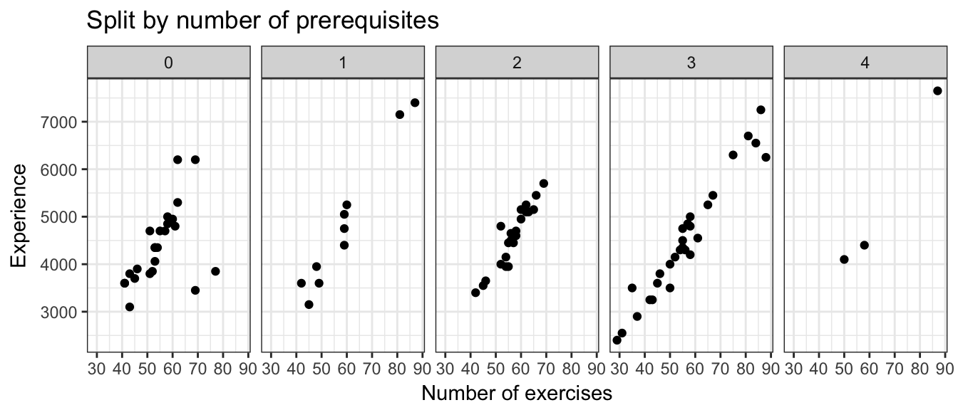 I assumed that the more difficult courses tend to have more prerequisites, which may not be true as for many users, the first course might have the steepest learning curve and thus be the most difficult for them. But anyway, under my assumption I thought I’d see more experience given for the same number of exercises as the number of prerequistes increase. Not the case. Still not sure of the point of XP given per course haha..
Now comes the part that I really wish DataCamp gave the age of the course or the day it was released. I wanted to see which technology was ‘more popular’, but of course with the current data I can’t answer that. Anyway, first lets try just looking at the average number of participants by technology.
courses_all %>% group_by(tech) %>%
  summarise(avg_num_participants=mean(num_participants),
            avg_num_hours = mean(num_hours),
            most_popular_course = max(num_participants),
            total_participants = sum(num_participants),
            n = n())
## # A tibble: 3 x 6
##     tech avg_num_participants avg_num_hours most_popular_course
##   <fctr>                <dbl>         <dbl>               <dbl>
## 1 python             32248.73      3.846154              452593
## 2      R             24142.83      4.169492              558270
## 3    sql             30693.00      4.500000               54973
## # ... with 2 more variables: total_participants <int>, n <int>
There are many more R courses but python courses seems to have the higher average number of participants even though R has the most popular course. Let’s look at a boxplot. It’s zoomed in to stop at the whiskers.
ggplot(courses_all, aes(x=tech, y=num_participants)) + geom_boxplot() +
geom_jitter(width=.2) +
coord_cartesian(ylim = quantile(courses_all$num_participants, c(0.1, .95))) +
theme_bw()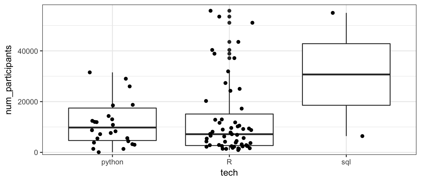 Yes, there are a number of R courses that are more popular than Python courses, but there are also many R courses that have very few participants. This is why I wish I could know when each course started. I’m not sure whether these courses were unpopular or whether they’re just new.
There are plenty other things I can look at, but I’ll stop for now as the post is getting plenty long. If you want the scraped data, you can find the code on my Github!